
Alma Oscura Café
Build a cohesive visual system rooted in the café’s character—celebrating the warmth and grit of the owner’s Mexican heritage.
- Creative Direction
- Visual Identity
- Brand Application
- Print & Packaging
- Merchandise Design
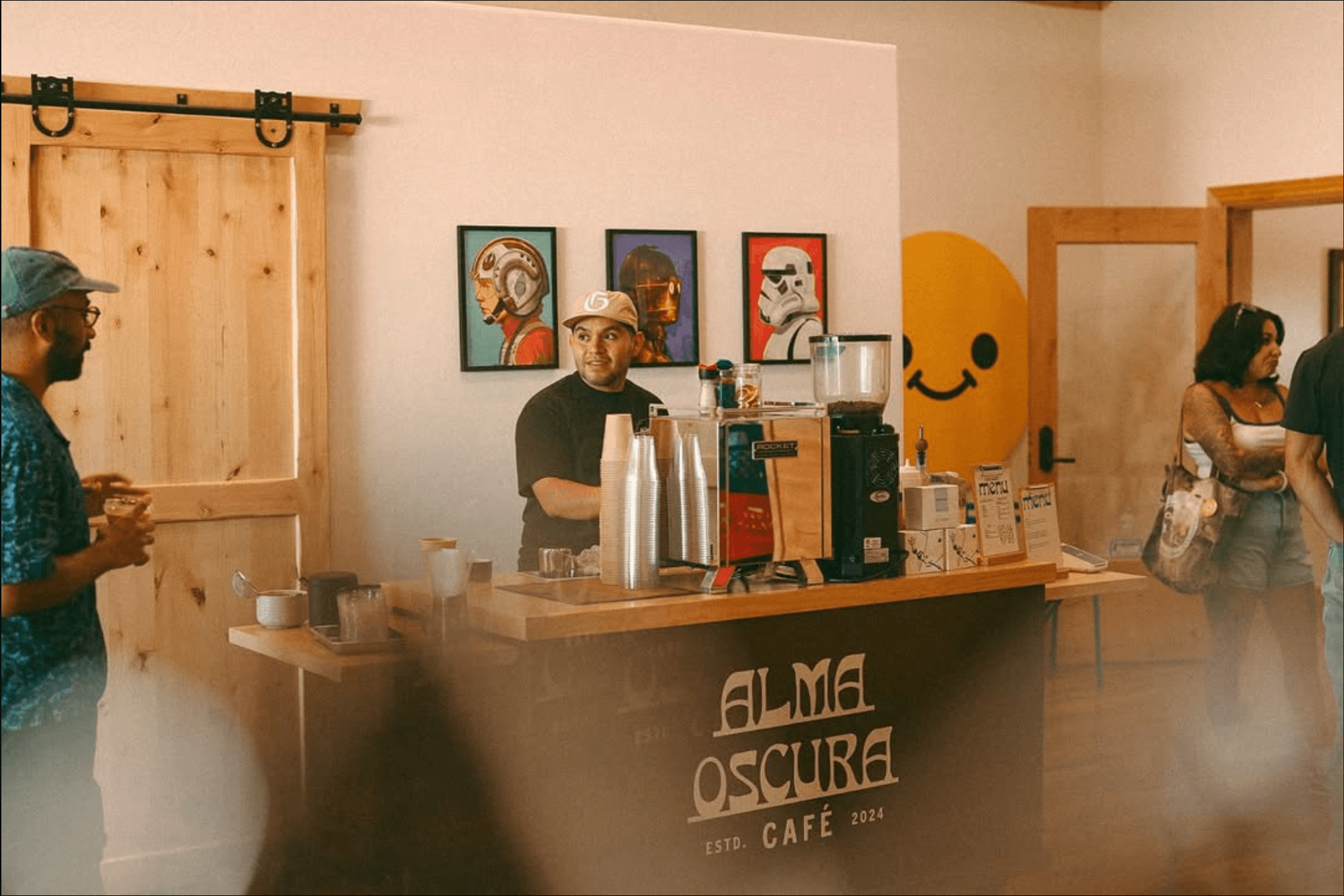
Alma Oscura Café arrived with an existing logo and an ambitious vision—but no system to carry it.
Without a defined palette, typography, messaging, or application framework, the brand lacked consistency across touchpoints. Our role was to build a cohesive visual system rooted in the café’s character—celebrating artistry, coffee culture, and the owner’s Mexican heritage.
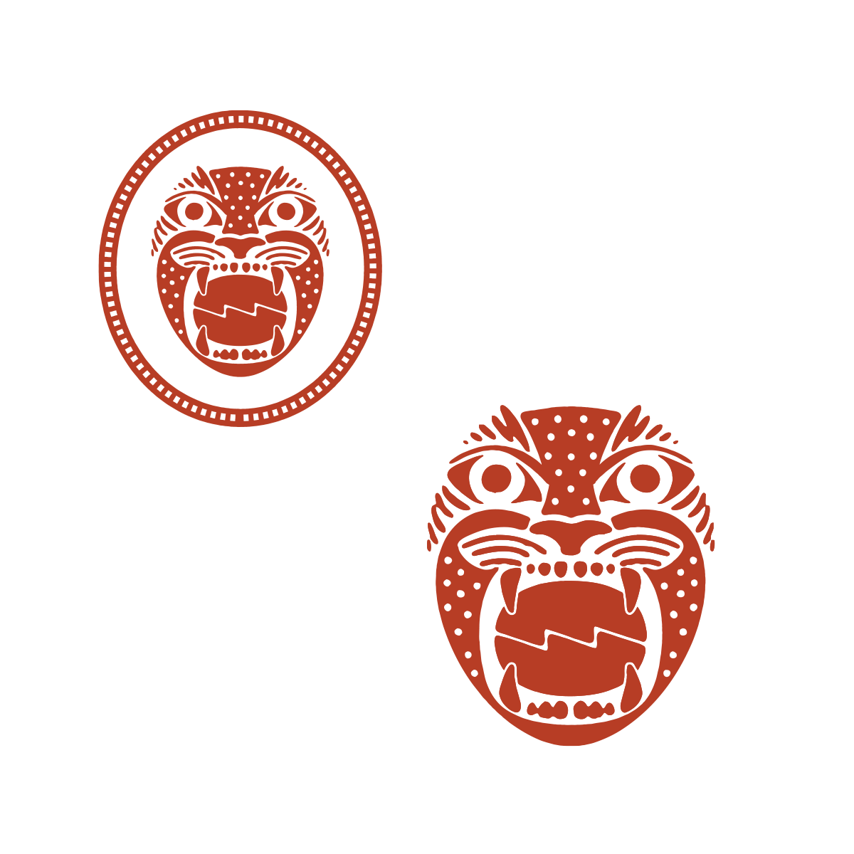
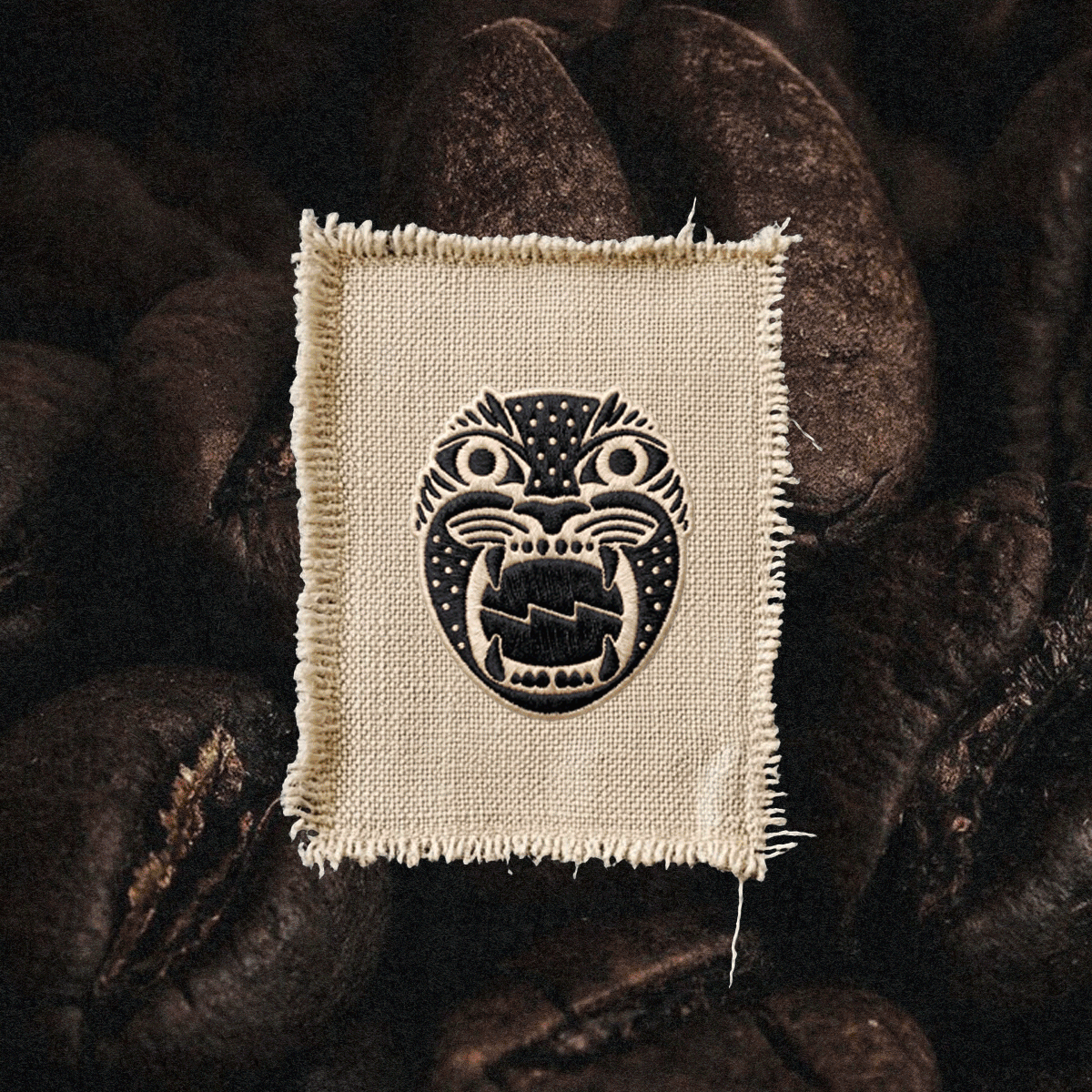
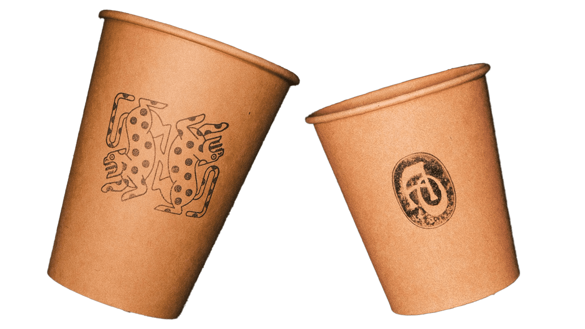
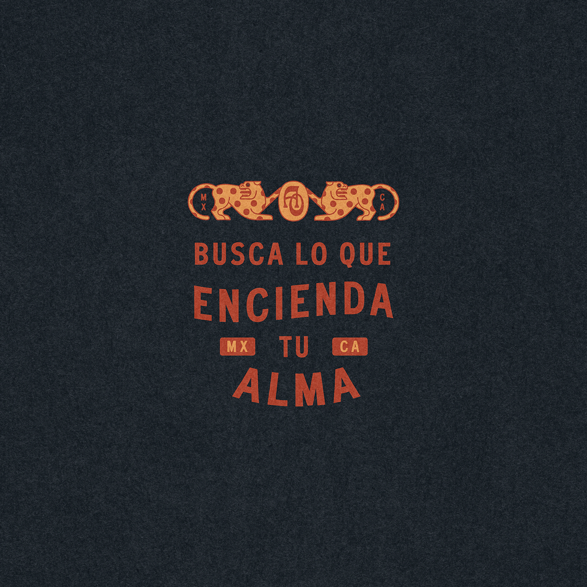
From the meaning of the name, “dark soul,” we developed a symbolic direction around the jaguar, inspired by its role as a god of the night in ancient Mayan culture.
We began by defining the character of the brand—something rooted in artistry, ritual, and a sense of depth. Drawing from the owner’s Mexican heritage, the identity needed to feel culturally grounded while still refined and cohesive.
The name Alma Oscura, meaning “dark soul,” became a central concept. From this, the jaguar emerged as a symbolic anchor—representing the night in ancient Mayan culture and reinforcing the brand’s tone and presence.
Rather than a generic café brand, we built a world with depth, symbolism, and cultural roots—one that rewards exploration.

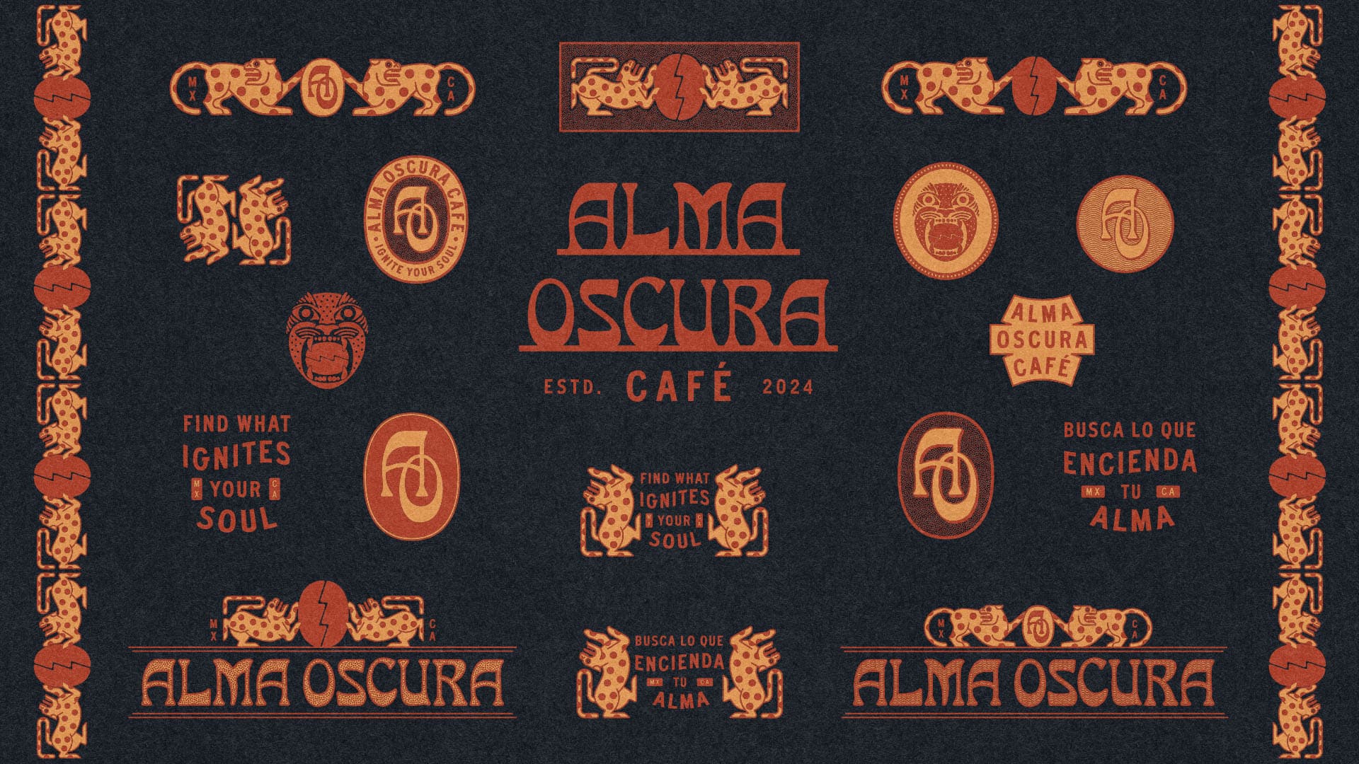
The primary mark utilizes display letterforms that feel rooted, layered, and alive—with symbolic elements that carry the weight of the name.
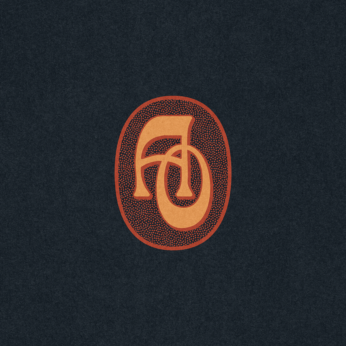
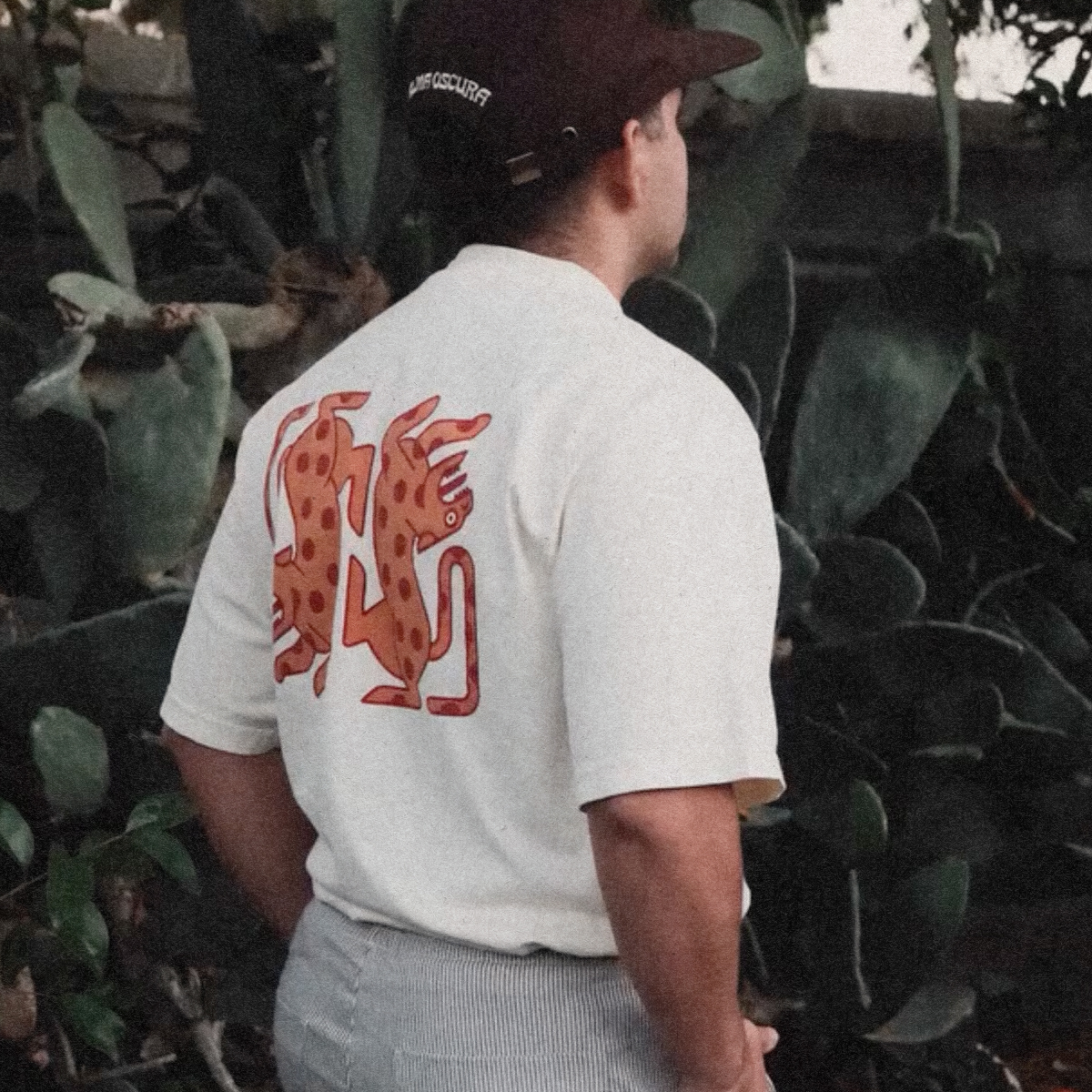
Supporting marks, typographic treatments, and symbolic elements—including the jaguar face, the AO monogram seal, and the banner wordmark—were developed to ensure the brand could show up consistently while maintaining a strong and recognizable character.
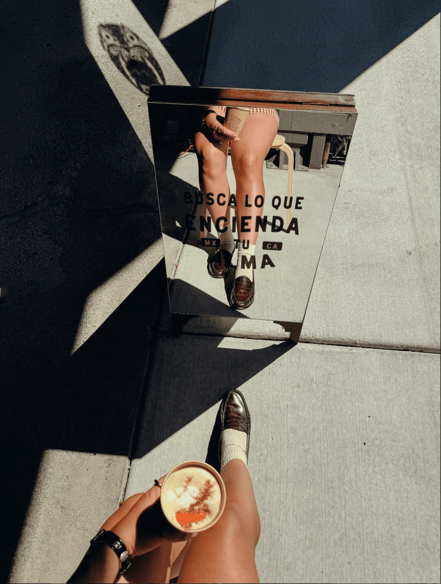
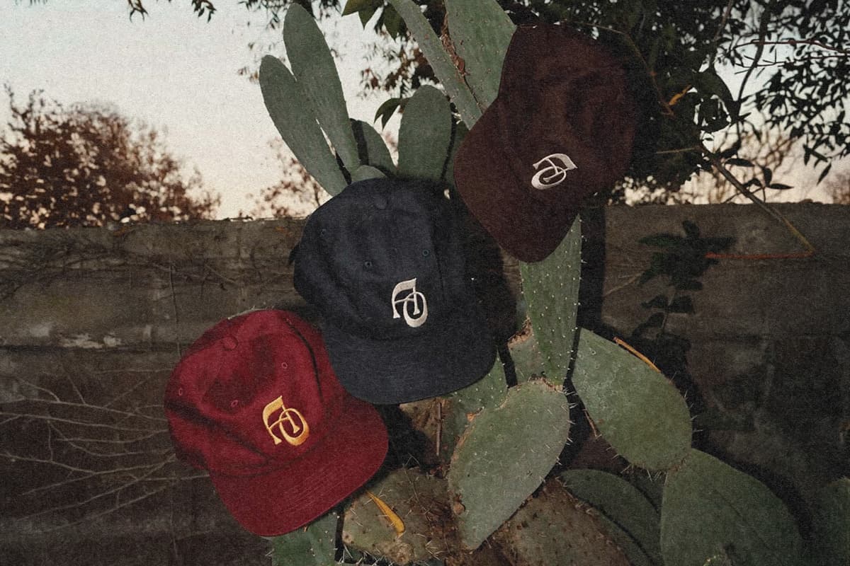
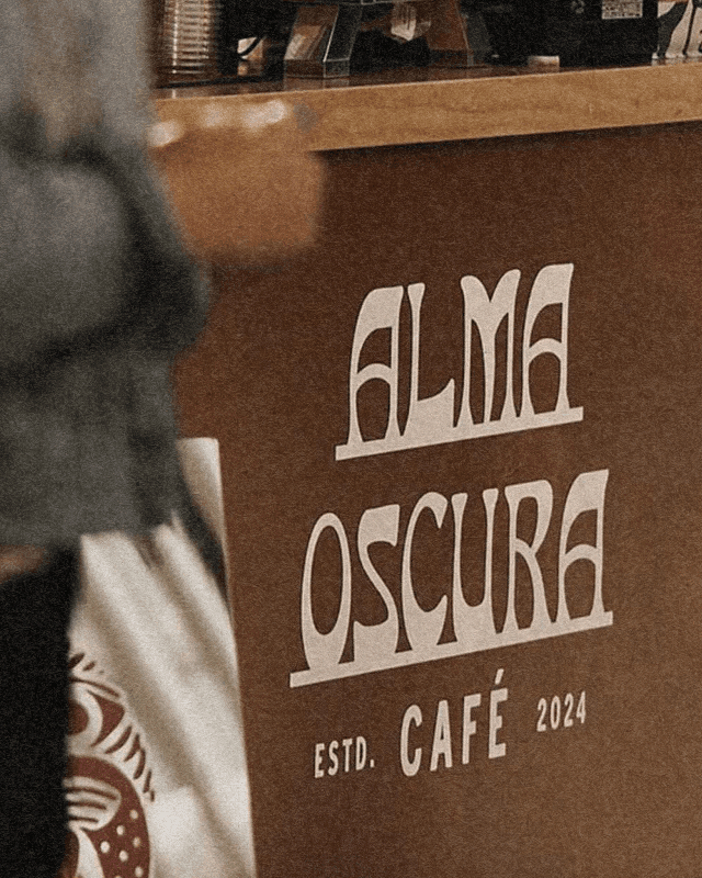
The identity system was designed to extend beyond the original logo, creating a flexible and cohesive visual language that could adapt across a range of applications from embossed merchandise to printed menus.
The visual language balances boldness with restraint. A controlled color palette and strong typographic structure create clarity and consistency, while detailed illustrative elements introduce depth and storytelling.
The result is a system that feels both expressive and disciplined—allowing the brand to remain cohesive across formats without losing its identity.

What ignites your soul? It’s more than coffee—it’s the ritual, the warmth, the moment of pause.
The system was built with real-world use in mind—translating seamlessly across physical and digital touchpoints. From packaging and menus to signage and branded merchandise, each element works together to create a unified and immersive brand experience.

Cultural influence played a key role in shaping the identity—not as decoration, but as foundation.
Elements of Mexican heritage were incorporated thoughtfully—drawing on the visual language of ancient Mayan iconography, the symbolism of the jaguar, and the warmth of craft and community.
This grounding gives Alma Oscura a distinct point of view and a deeper sense of authenticity that resonates with both the owner’s story and the café’s community.
- Services
- Creative Direction
- Visual Identity
- Brand Application
- Print & Packaging
- Merchandise Design
- Industry
- Café & Food & Beverage