
Casa Maestri
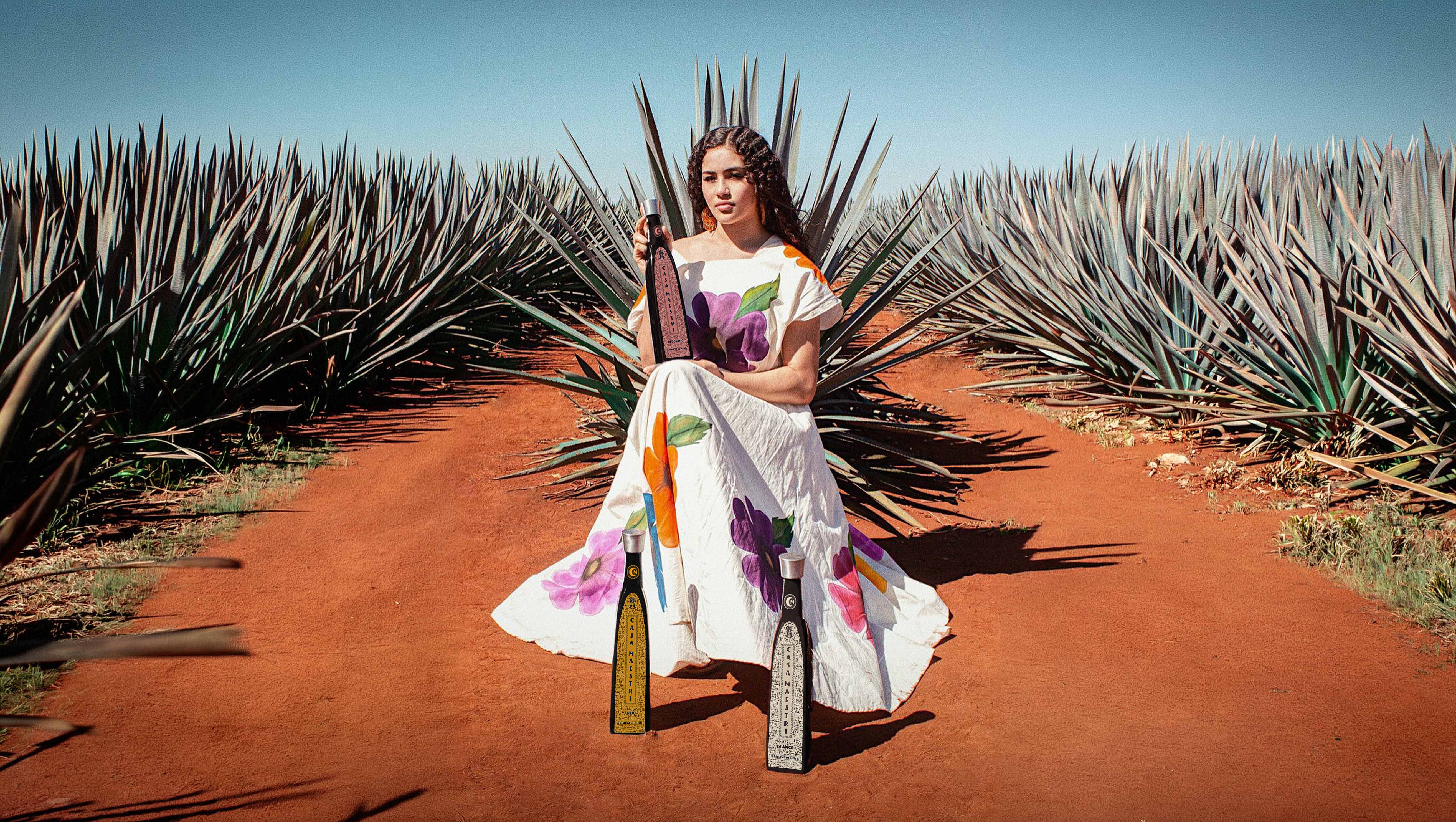
Overhaul a dated identity for a legacy tequila house—grounding it in the culture and mythology of the land it comes from.
- Creative Direction
- Visual Identity
- Brand Application
- Print & Packaging
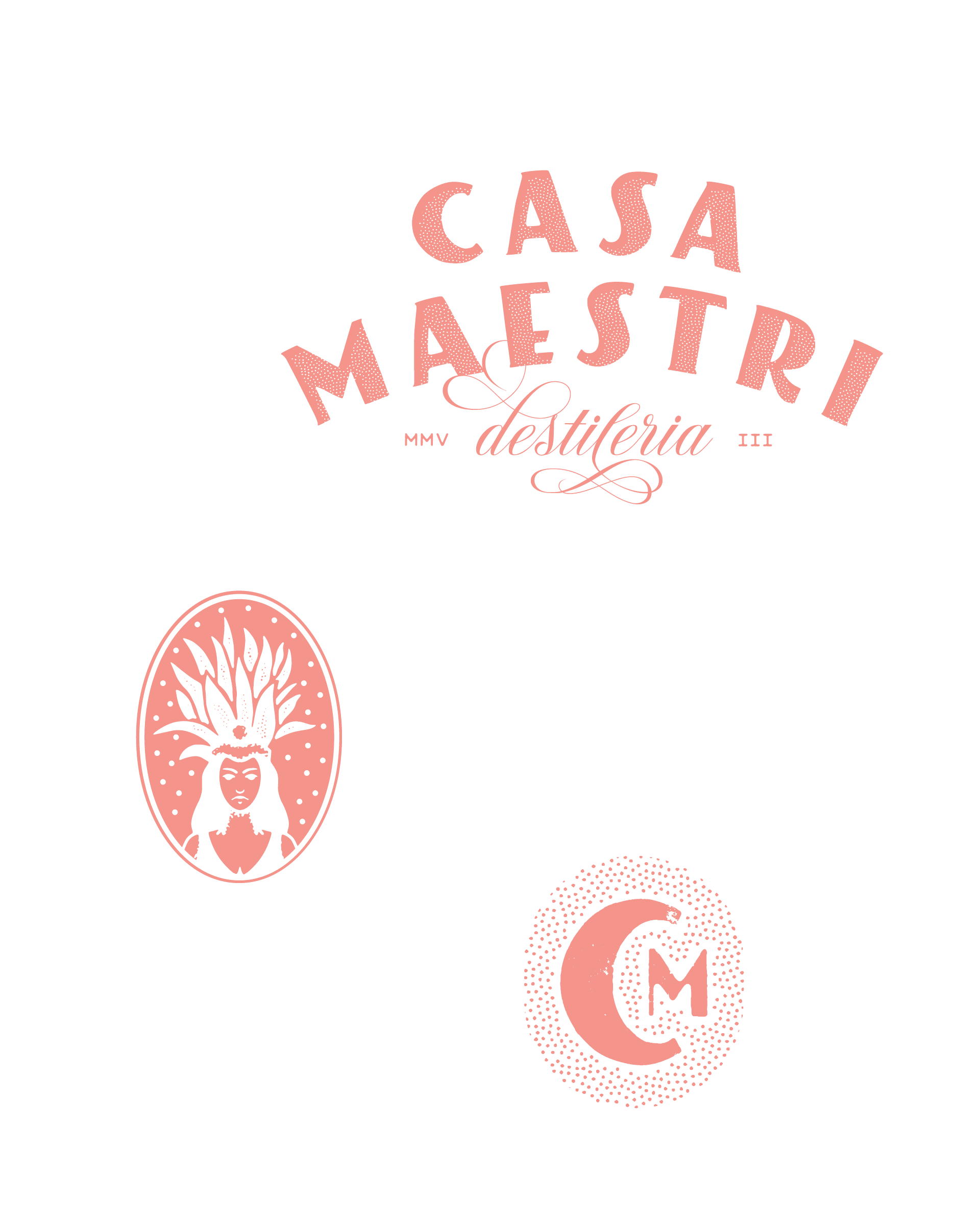
Casa Maestri had the legacy and the product—but an identity that no longer matched either.
The brand’s visual system had become dated. Nothing about it told a buyer where the tequila came from or why that mattered. Our role was a full visual identity overhaul—one that could carry the weight of the brand’s heritage while feeling refined and current on shelf.
We started where the tequila starts: in Tequila, Jalisco, with the agave and the traditions that surround it. Before a single mark was drawn, we went looking for the story the brand already owned.
We began with research, not design. Every project starts by asking what is true about a brand that no competitor can claim. For Casa Maestri, the answer was place—the agave fields of Jalisco and the centuries of ritual tied to harvesting and fermenting the plant.
That research led to Mayahuel, the goddess of the agave in the Aztec tradition of central Mexico. In the myth, she descends from the sky with the god Quetzalcoatl; when her grandmother, a star demon, destroys her, he buries her remains—and from them the first agave grows. The plant is her body, and the drink fermented from it was held sacred.
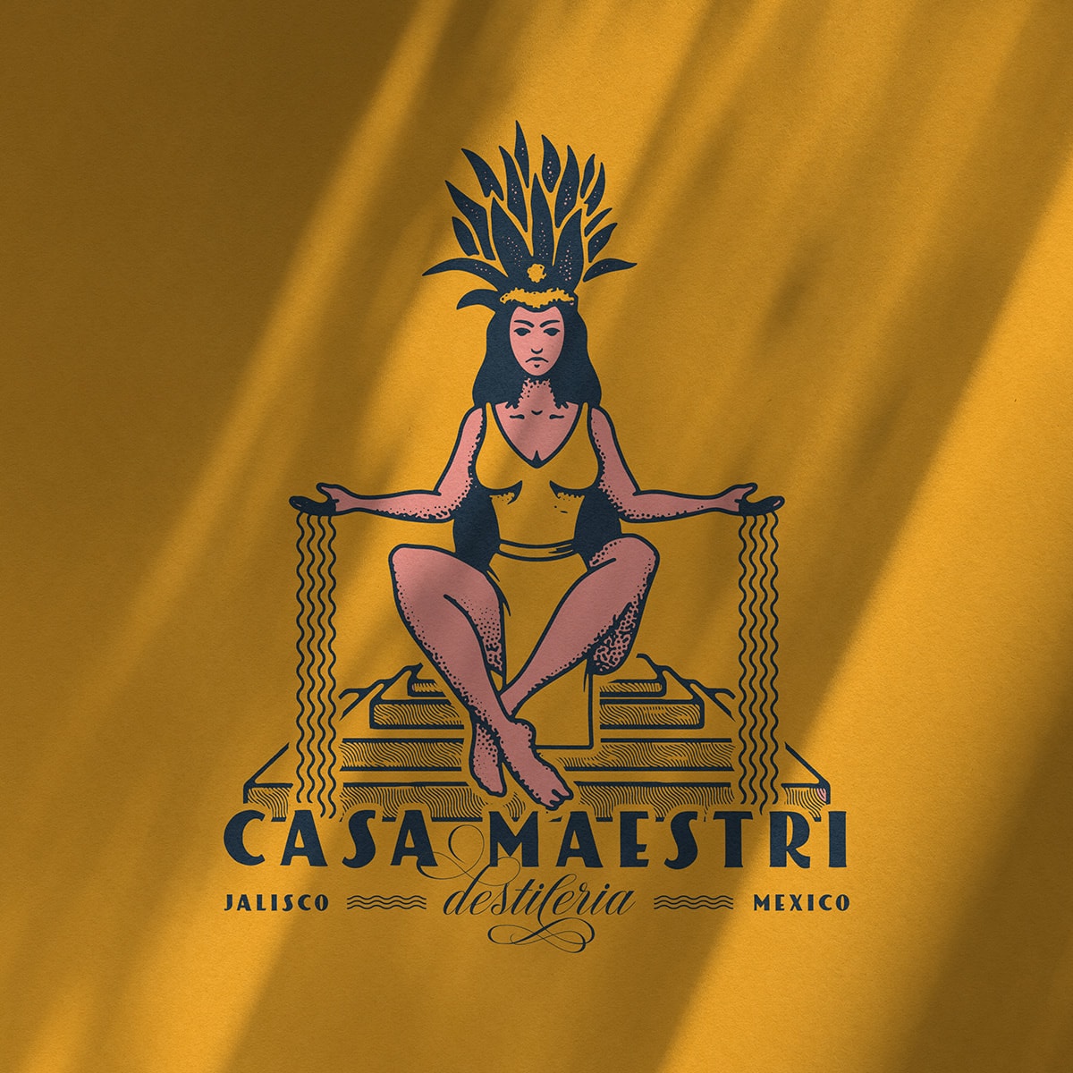
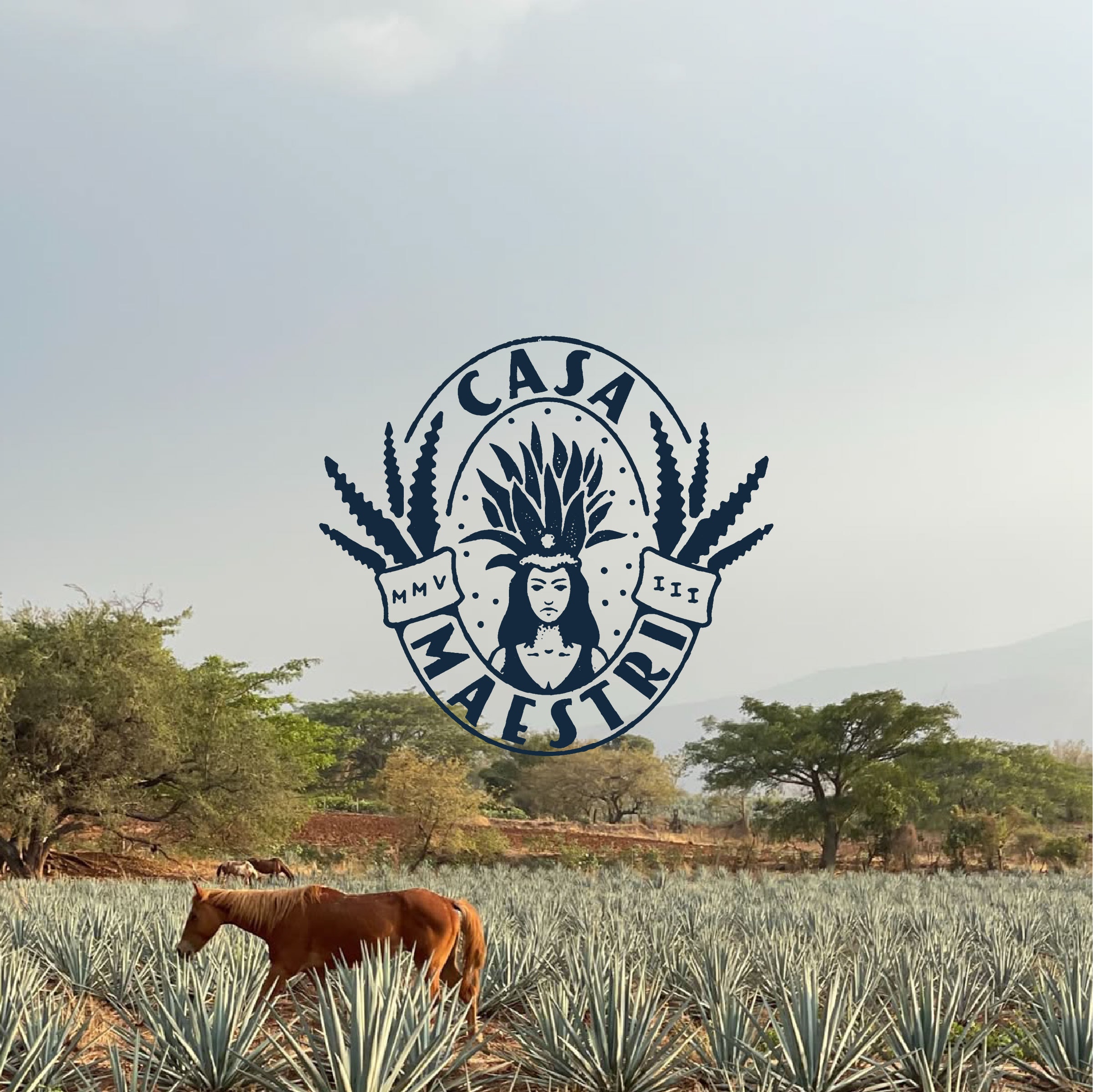
Every bottle of tequila begins with the agave. In Mayahuel, the brand found a story as old as the plant itself.
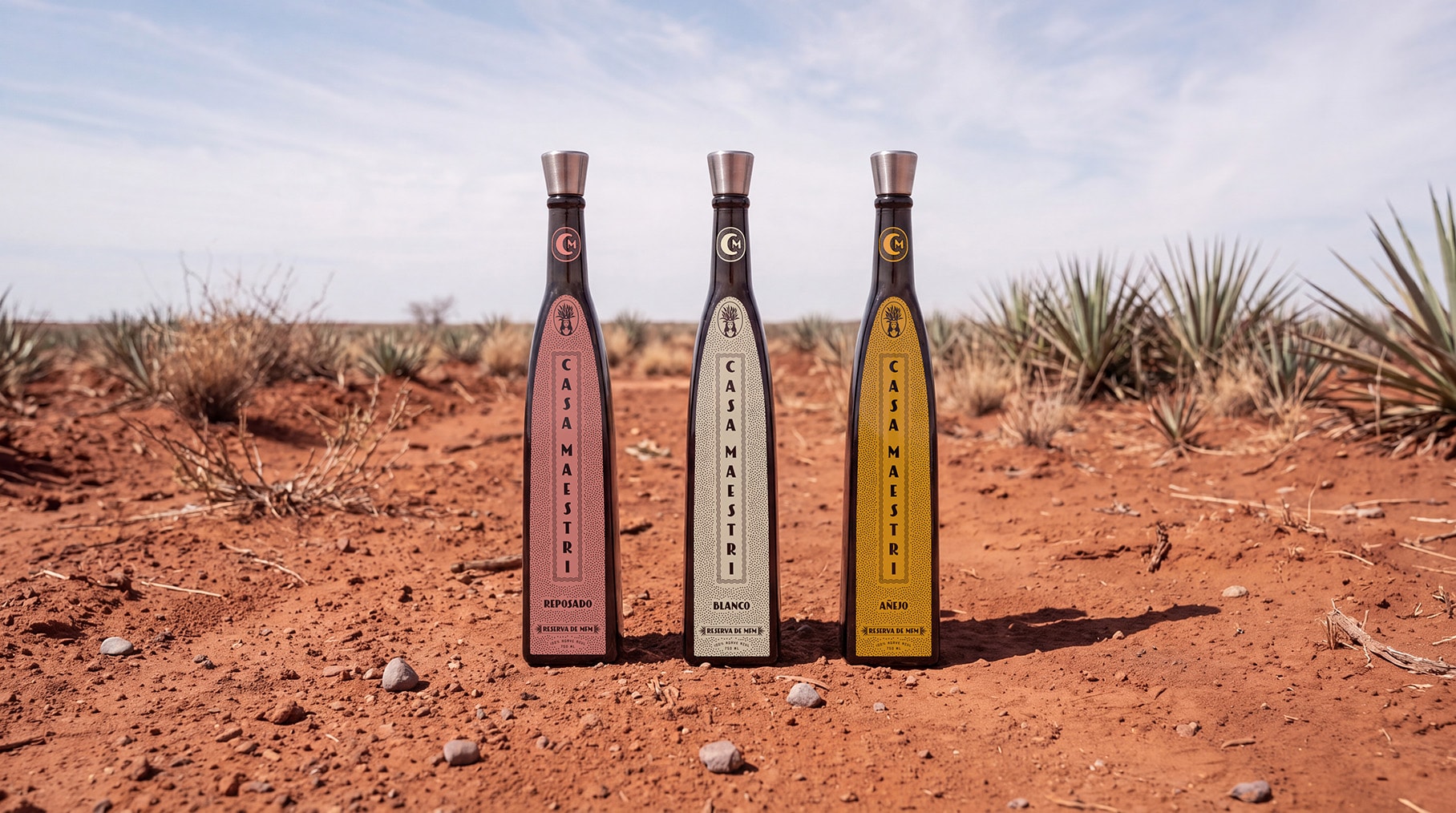
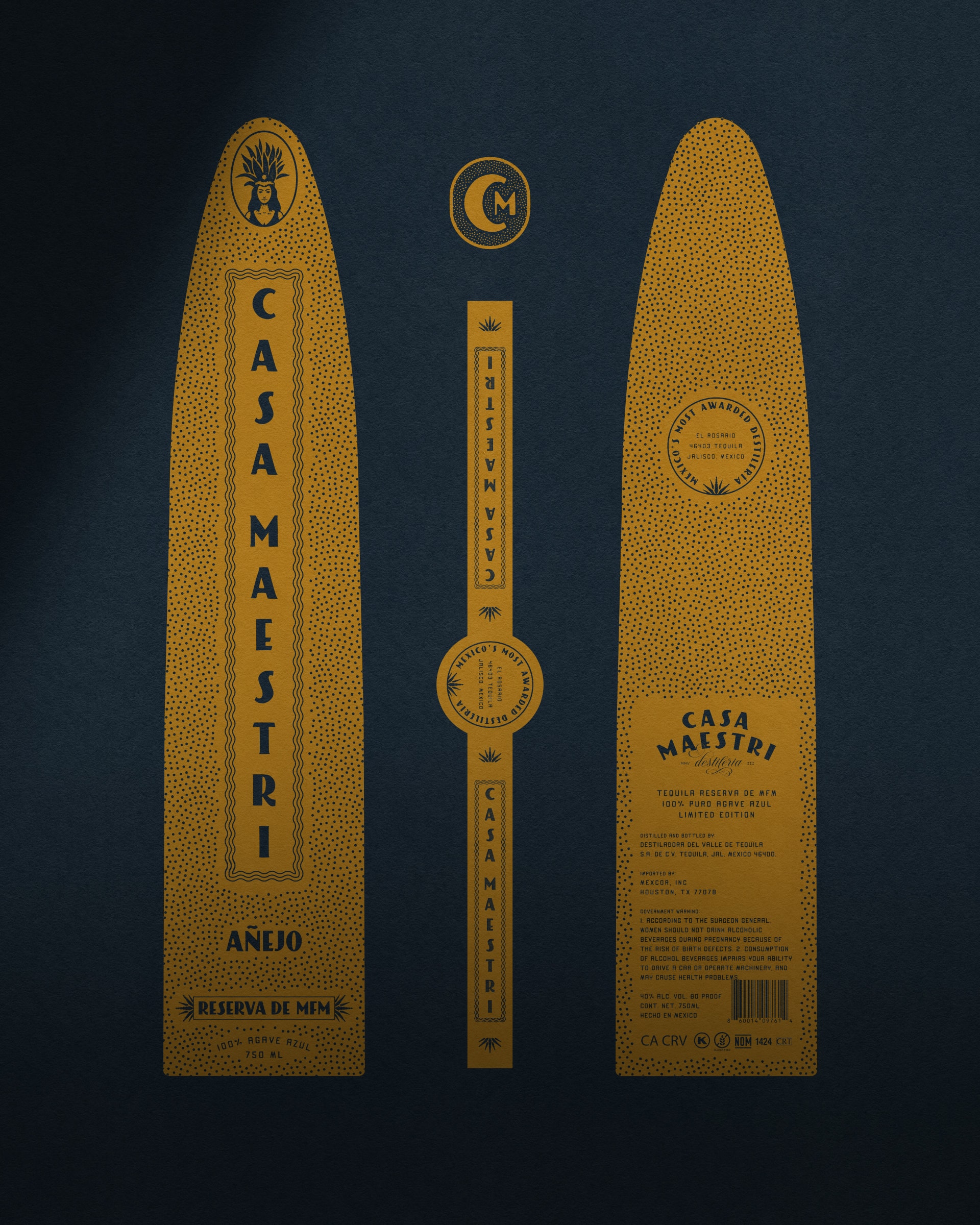
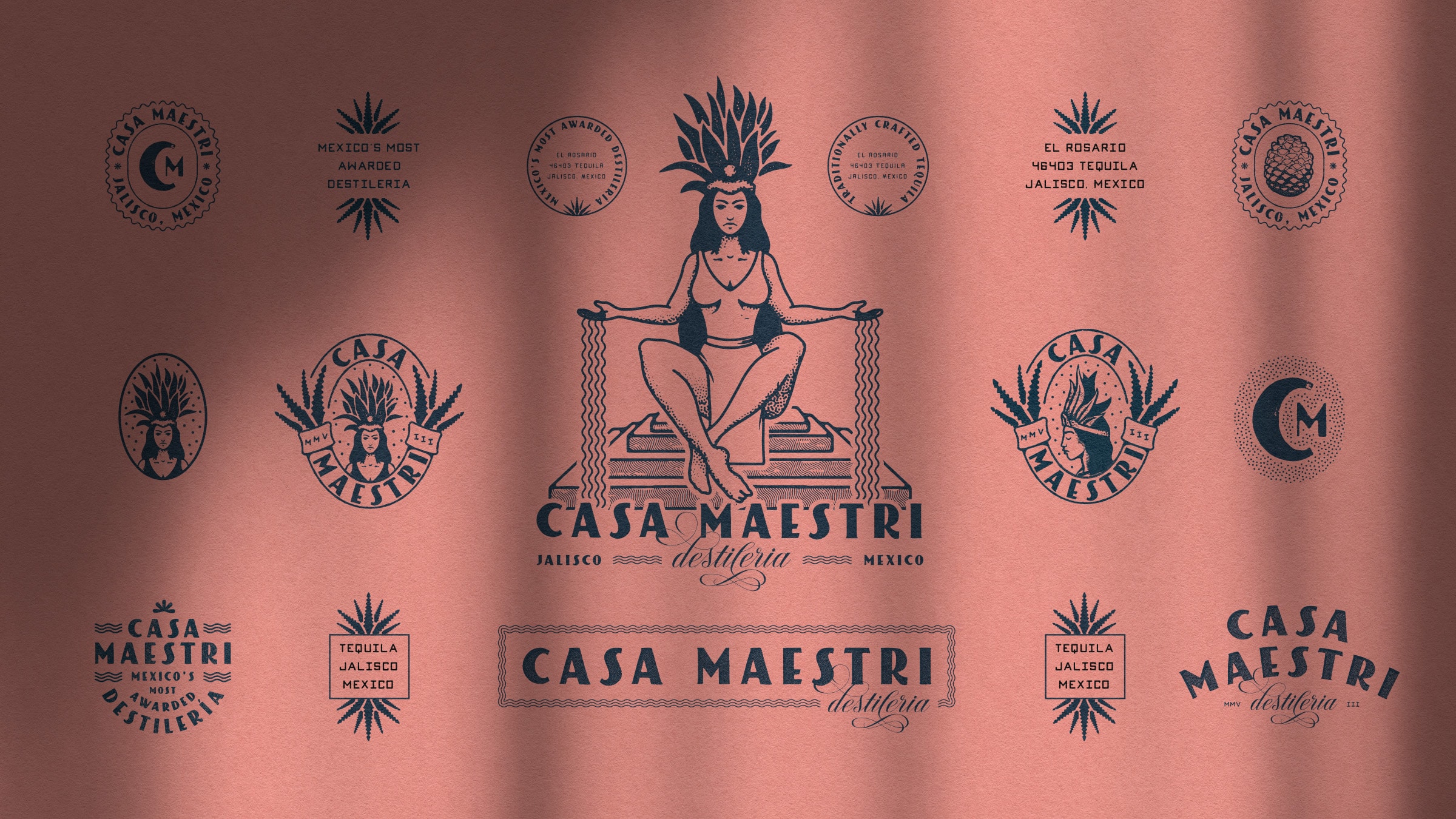
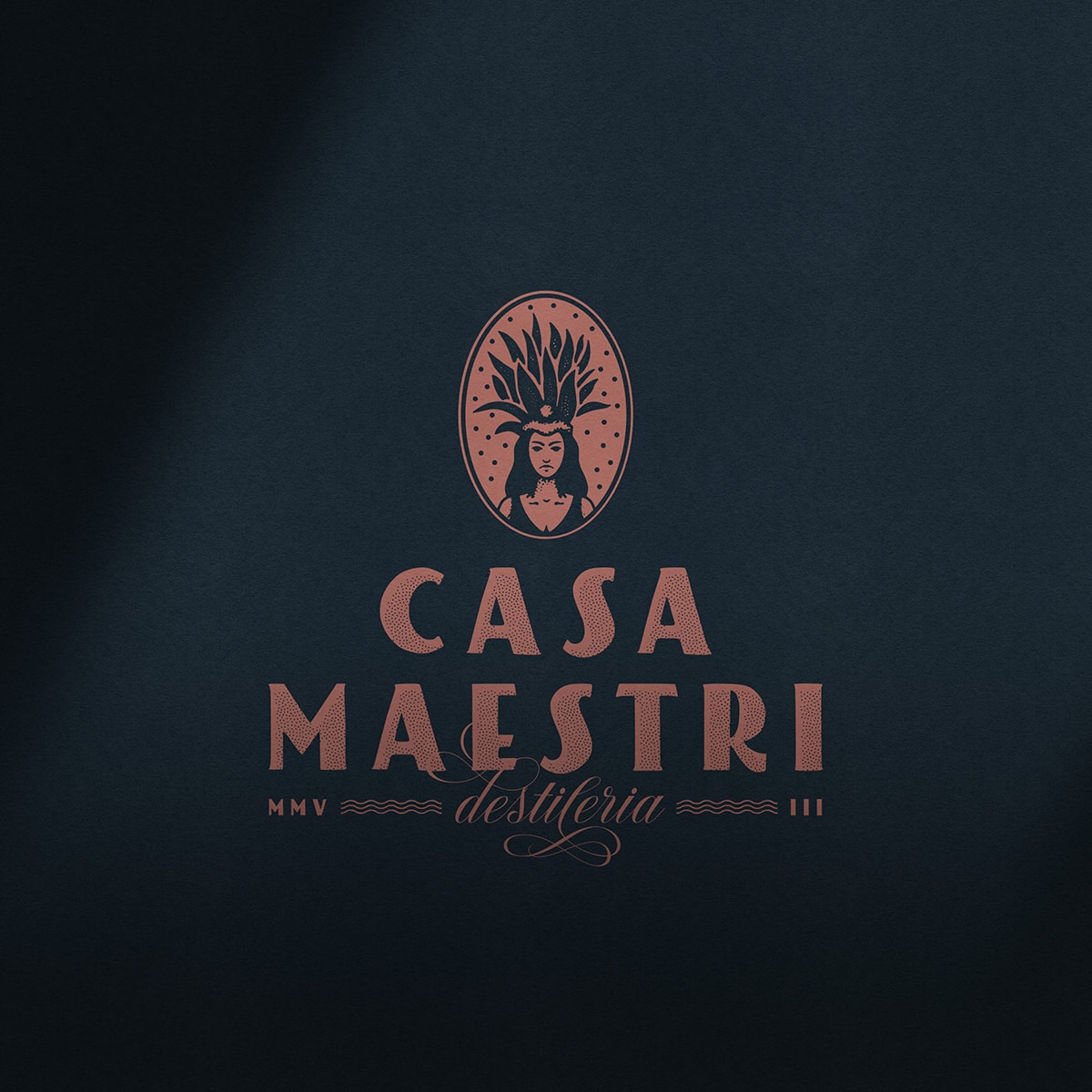
Mayahuel became the anchor of the identity—a symbol of nourishment, abundance, and the agave as a gift.
She is remembered as the mother of the Centzon Totochtin, the four hundred rabbit gods of fermented agave. Building the system around her gave Casa Maestri something a dated mark never could: a reason behind every visual decision, and a direct line between the liquid and the ground it comes from.
From there, the identity was designed to extend beyond the logo. Supporting marks, typographic treatments, and illustrative elements were developed as a flexible, cohesive language that holds together across the range.
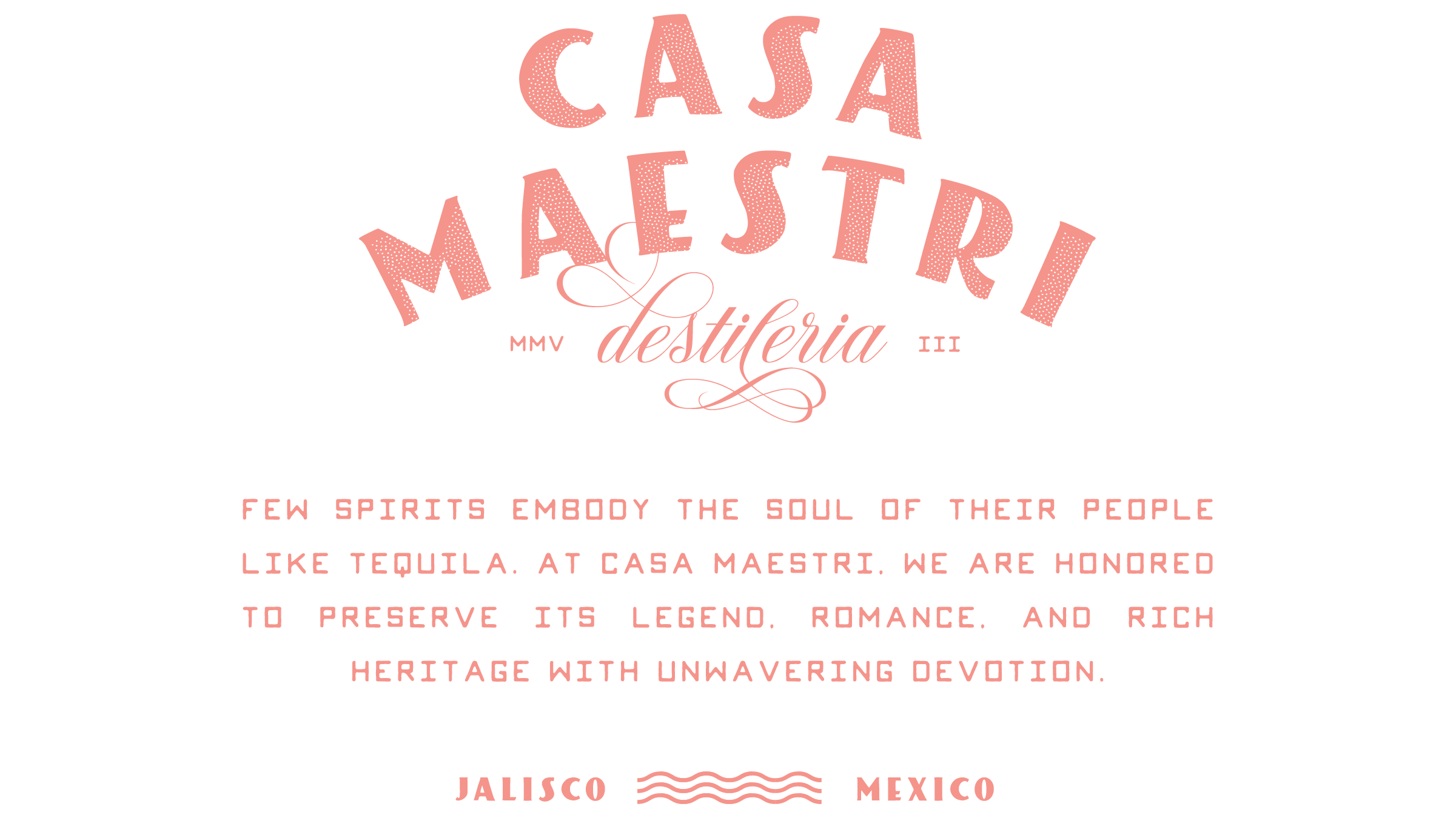
The visual language balances tradition with refinement. A restrained color palette and strong typographic hierarchy communicate quality, while hand-crafted illustrative elements introduce depth and storytelling.
The result is a system that feels considered and timeless—recognizably one brand on every bottle, without losing what makes each expression distinct.
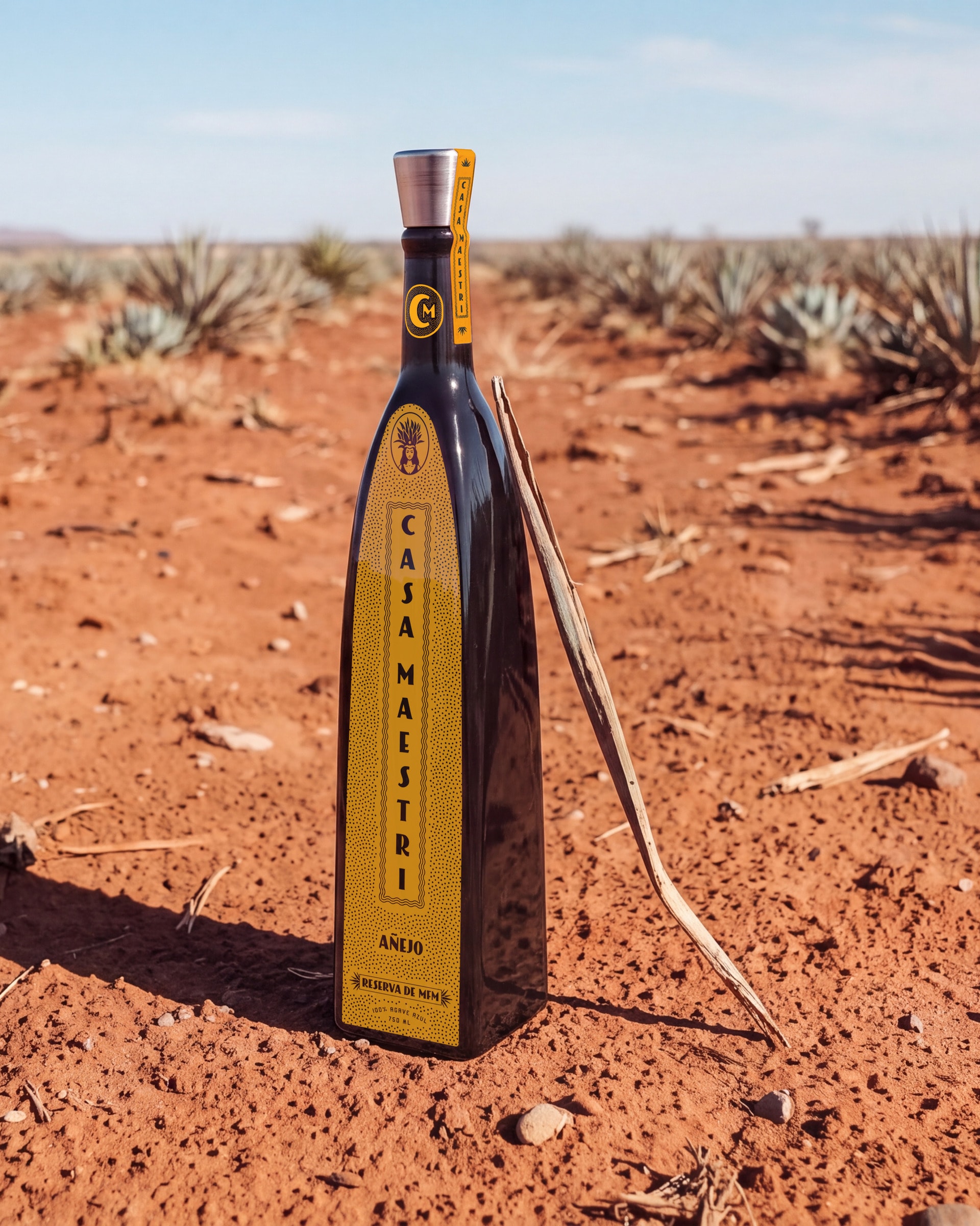
A legacy brand has to look as good on the shelf as its story sounds—so the system was built for real-world use from the start.
From bottle labels and packaging to print collateral and brand materials, each element works together to create a unified, premium experience. That consistency makes the brand feel intentional at every interaction, rather than fragmented across contexts.
Culture played the central role in this identity—not as decoration, but as foundation.
Mayahuel was not chosen because she looks good on a label. She is the origin story of the agave itself, and honoring her honors the growers, the harvest, and the traditions behind every bottle.
That grounding gives Casa Maestri a distinct point of view and an authority that feels earned rather than manufactured—a legacy brand whose identity finally tells the story it has always had.
- Services
- Creative Direction
- Visual Identity
- Brand Application
- Print & Packaging
- Industry
- Spirits